Responsive Landing Page with Marketo Integration
As a very varied part of my day job as a technical marketing consultant, there are many varied tasks that are required of me, to maximise conversions for landing page sign-ups and lead acquisition. To this end we decided to take the baseline landing page for free trial reigstrations and give it a facelift and introduce some interesting conversion increasing features.
Here’s the original landing page, a straightforward light landing page, with the minimum amount of form fields that were originally needed to qualify a lead in or out:
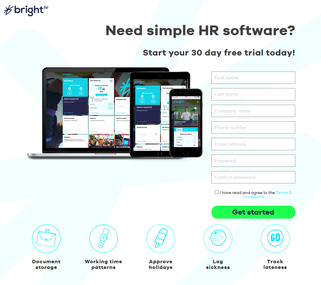
Original Landing Page
After working with the UI/UX team and spending some time determining the success criteria and blockers to the registration page, the UI team developed a new layout and a radical new structure. A few days later the PSD’s found there way into my inbox and it was time to start developing a mobile first responsive design for the new landing pages.
Key success criteria:
- To increase conversion ratio from on-page visitors to acquired leads
- To decrease visual and physical blockers for signing up to the 30 day free trial
- To provide an intuitive landing page with a clean user journey from awareness to engagement
The new registration page delivered this in a number of ways:
The page was split into 5 main sections
The main registration form (more on this in a moment), product features, testimonials, in-house support, iOS and Android appsThe user journey from awareness to engagment to ultimately signing up for a product free trial is simple, clean and effective, the main form only displays 3 initial fields, so we have removed the blocker from an initial 7 field sign-up to an initial 3 field sign-up process.
As we are catering for users who may, or may not be aware of the brand or the product, we keep them on the page with in-page navigation through the features, and testimonials and other value-adds for the product. They can either sign up for the free trial if they are already engaged, or they can gleam more information around the product if needed.
Reduction in form fields shown
This one is a favourite of mine, as one of the biggest blockers in getting people to sign-up for anything in this day and age is increasingly more difficult. To that end we reduced the number of initial fields shown to the user (first name, last name and email address). Once they hit the ‘sign-up’ button they enter the second stage of the registration.
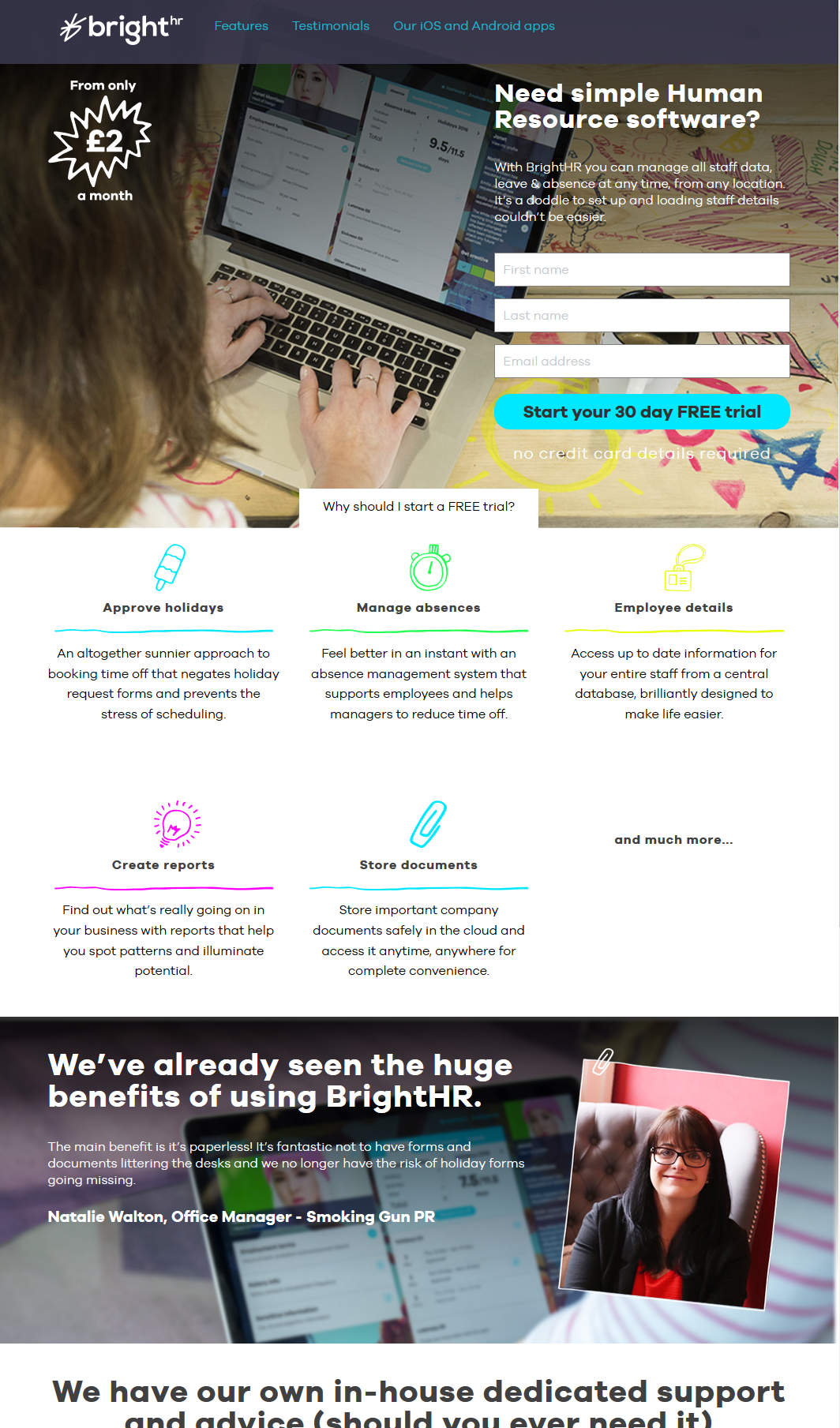
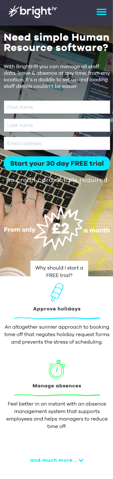
New Landing Page
As we only require a few additional fields, we present them with a simple modal dialog asking for a few more small pieces of information before they can finally enter the free trial.
Why does it work?
Simple… Once a user has initially committed to putting their information into the form, they are increasingly unlikely to abandon the registration process as they progress to the second stage. Both the abandonment and bounce rate on the page has already decreased by over 42% and we haven’t even done any additional A/B variants or Google Experiments for split testing.
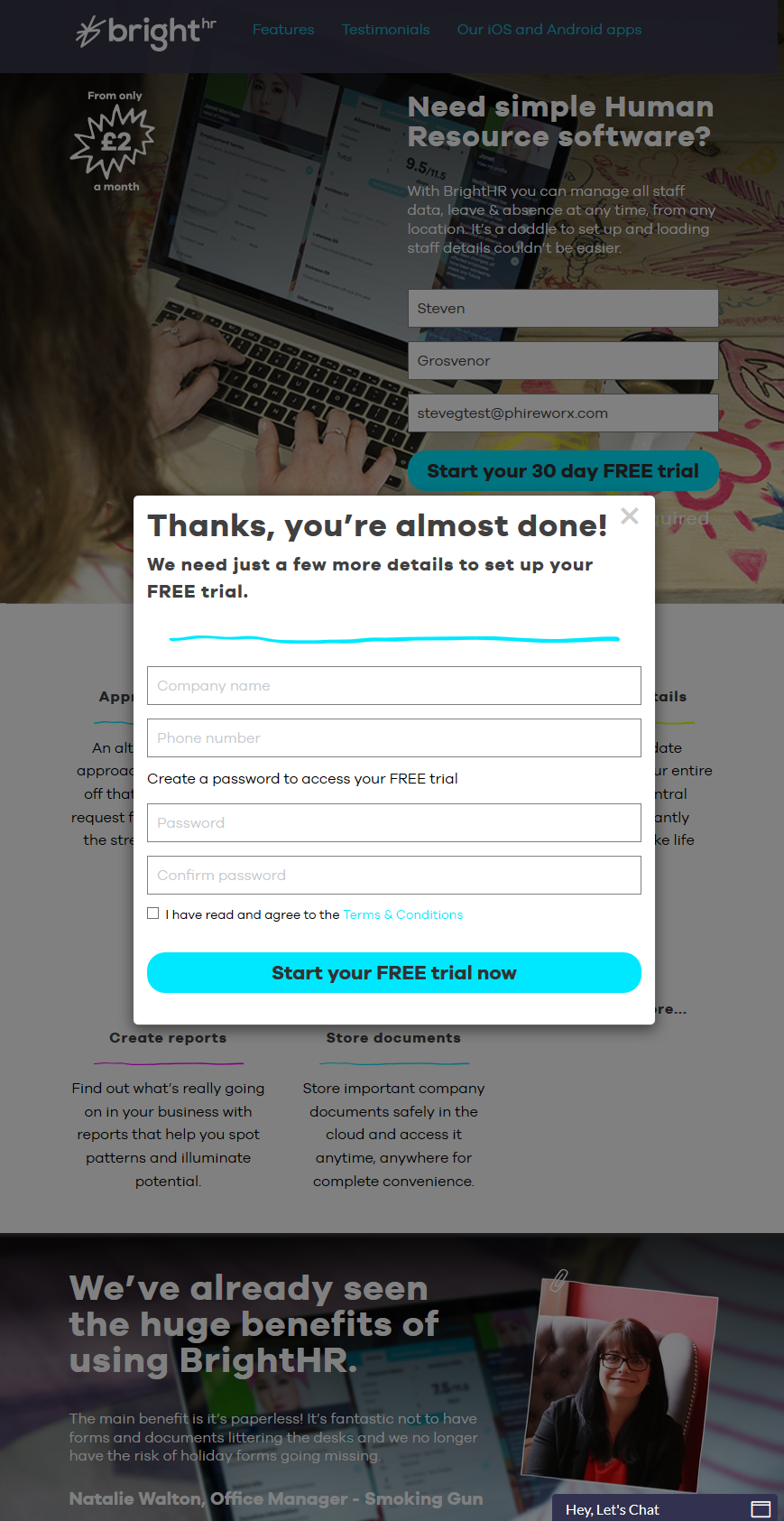
New Landing Page – Step 2
So, by giving the user access to as much or as little information depending on where they are in their user journey, we can maximise the potential conversions on the landing page, whilst decreasing visual and physical blocks to the user registration process.
As a given, the design works beautifully on both desktop, tablet and mobile devices.
Mobile View